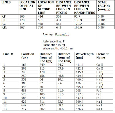
PART A and B
< --------
PART C:
1) The image isn't set up to do that- there are margins on the image that should be taken into account.
2) It looks like most of the light came from hydrogen, but a lot of it came from heavier elements like iron and sodium. So, no, not really dependent on this composition, unless there are some mistakes.
3) Well, a not-so-simple step could be to check what the spectra sensors say in space, outside of the atmosphere, about the solar spectra and compare it to the spectra sensor on earth.
4) The thicker lines means that there is more of that gas blocking the light, so in a sense, it is "stronger" because it's absorbing more.
5) Of course! The discrepancy ranged from 5-30 or so nanometers away.
6) I'm sure that each element has a range of wavelengths it emits, since we don't have 500 or more elements to each have its own specific wavelength. The wavelength measurements were hard to get because the image was small enough that one could not be very specific in the clicking to find the coordinates. One must consider whether to click on the edge of the line or the middle of the line, and that sort of thing. The scale factor was determined to be very close to 0.30, so there wasn't a huge percent error in that calculation. These factors didn't have a very large affect on the calculated results- the calculated results were off because each element has a wavelength set of light that it could emit.
No comments:
Post a Comment